

Start with a result the reader can recognize
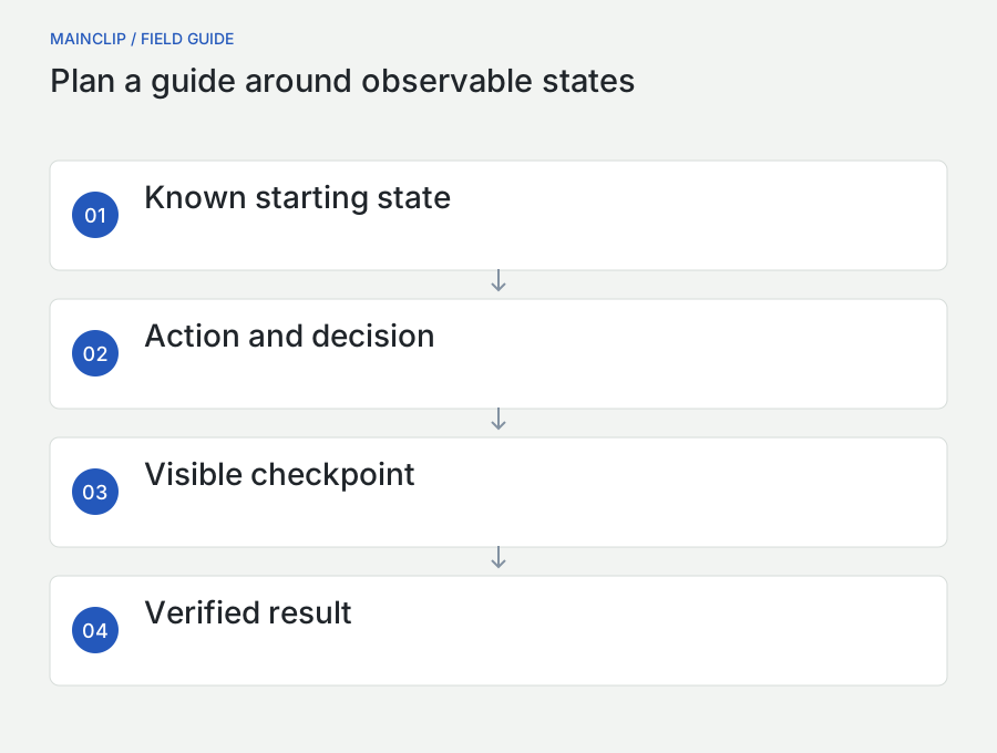
A useful step-by-step guide gets someone from a known starting point to a visible result. Screenshots help the reader recognize locations and states, but the sequence does the teaching. Before opening a capture tool, finish this sentence: “After following this guide, the reader will be able to…” Choose something observable, such as exporting a document into a chosen folder, preparing an image for a support ticket, or finding a previously copied link. “Understand the application” is too broad to organize into a reliable procedure.
Decide who the reader is and what they already have. A colleague who uses the application every day needs different instructions from someone opening it for the first time. Record whether the guide assumes an installed app, an existing account, a particular role, or a sample file. Make those assumptions visible before step one. An administrator-only button cannot be made accessible to an ordinary account by adding a more emphatic arrow.
This article develops a practical authoring workflow on a Mac. Its extended examples use an invented desktop application called Fieldboard and synthetic project information. They demonstrate how to design instructions; they are not claims about a real product, customer, or measured usability study. Where MainSnap or MainClip appears, the discussion is limited to their available capture, annotation, export, and clipboard-history roles. The procedure can also be followed with the screenshot tools built into macOS.
Write the completion check first
For a guide called “Export a weekly task list,” a completion check might be: “Open the destination folder and confirm that Weekly Tasks.pdf contains the three sample tasks.” That check constrains the rest of the article. You now need to explain how to select those tasks, choose the export type, identify the destination, and verify the output. You do not need to introduce unrelated preferences or every alternative way to open a project.
Map the workflow before capturing the interface
Perform the task once without taking screenshots. Write a rough action list while noticing every decision you make automatically. You may already know which project is correct, whether an export replaces a file, or why a disabled button is expected. A new reader does not share that knowledge. These are candidates for prerequisites, checkpoints, or short explanations beside the relevant step.
Separate actions from states. “Click Export” is an action. “The export panel shows the current project name” is a state. A procedure becomes much easier to troubleshoot when the author knows which state should follow each important action. You do not need to capture every transition. Capture the states that prove the reader is in the correct place, expose a meaningful choice, or confirm that the task finished.
| Workflow moment | Reader's question | Useful evidence |
|---|---|---|
| Starting project | Am I working in the right place? | Window title and project heading |
| Export choice | Which option should I select? | Focused view of the available formats |
| Destination | Where will the file go? | Folder and filename fields |
| Completion | Did the operation work? | Resulting file or explicit confirmation |
Use this map to choose the guide's boundary. If account creation is a separate ten-minute task, link to its own instructions instead of hiding it inside “sign in if necessary.” Conversely, a small necessary action such as opening a sidebar should stay in the main sequence. The test is whether the reader can reach the next documented state without guessing an undocumented operation.
Prepare a repeatable demonstration environment
Create a small sample project with information that can safely appear in public. Give it names that communicate purpose: Weekly Tasks, Draft Review, and Sample Notes are easier to follow than random identifiers. Avoid realistic personal email addresses, actual client names, billing records, and copied production data. Synthetic content should be plausible enough to explain the interface without being mistaken for a real person's information.
Reset the relevant settings before the capture run. Record the application version, interface language, window size, and any preference that changes the route. Close unrelated windows and remove distracting notifications from the working area. This preparation is about making the example reproducible, not pretending that every reader's desktop will be identical. Include a short note when the guide intentionally uses a particular layout or theme.
Keep a reset recipe beside the draft
For the Fieldboard example, a reset recipe could say: “Open the training project; restore the three original sample tasks; remove yesterday's sample export; return to the task-list view.” This private authoring note makes recaptures consistent. Without it, step two may show four tasks while step six exports three, leaving readers unsure whether they missed a selection action. The reset recipe also helps a second author reproduce the screenshots later.
Do not make destructive cleanup part of the reader's instructions merely because it helps your capture session. An author can delete a disposable demo export. A reader may have an important file with a similar name. Where replacement is possible, use a new sample filename and explain the choice before the reader reaches the confirmation dialog. Documentation should not rely on silently discarding existing work.
Choose each screenshot by the question it answers
A screenshot earns its place when it resolves uncertainty that the text alone would leave. A full window can establish orientation. A focused region can show a small control clearly. A result image can let the reader compare their outcome with the expected state. Repeating nearly identical full-window captures after every click often makes a guide longer without improving the instructions.
Apple documents Shift–Command–3 for a screen capture, Shift–Command–4 for an area, and Shift–Command–4 followed by Space for a window. Shift–Command–5 opens the Screenshot controls, including timing and destination options. Those built-in choices are enough for a straightforward capture session; see Apple's screenshot instructions. Pick the method that preserves the context required by the step.
Use a window capture when the title, sidebar, and main content jointly explain where the reader is. Use an area capture when a particular panel contains everything needed. Before tightening the composition, check that you have not removed the tab name, selected project, or other clue that distinguishes this screen from several similar ones. A perfectly sharp checkbox is not helpful if the reader cannot work out which settings page contains it.
Write a capture brief
A capture brief is a sentence such as: “Show the Export panel with PDF selected and the sample filename visible.” It tells you what must appear and what can remain outside the image. Add a note about the intended annotation and final placement width. This is especially useful when several people supply images: a clear brief gives them a common target without requiring the same monitor or desktop arrangement.
Capture a coherent sequence, not a collection of attractive images
During the capture run, keep the application window in a stable position and avoid resizing it unless a step requires a different layout. Maintain the same sample data, language, and theme throughout the sequence. A sudden change in project title or sidebar width can make the reader interpret an editorial inconsistency as part of the workflow. If a layout must change, explain the reason in the prose.
Name captures as you make them. A useful working name combines sequence and purpose, such as 01-project-overview, 02-export-format, and 03-save-location. These are authoring identifiers, not necessarily the final public filenames. They let you match an image to its capture brief and distinguish an original from an annotated delivery copy. Avoid using “final” repeatedly; a revision number or date is more useful when an image changes.
Inspect each file before advancing to the next major state. Check that menus stayed open, the important label is visible, and a tooltip did not cover the control. A capture taken a moment too early can show an empty loading panel. A capture taken too late can miss a brief confirmation. When timing matters, prepare the state again and make a deliberate replacement rather than editing the screenshot into a state that never actually existed.
Keep source and delivery images separate
Retain an unannotated source for future revisions in a restricted working folder, and place ready-to-publish exports in a separate delivery folder. The distinction prevents an editor from accidentally uploading a source that still contains information covered only in an annotated copy. It also avoids repeatedly compressing an already exported image when a label needs a small change. Limit access to sensitive originals and retain them only when there is a reason.
Write steps that specify action, object, and expected change
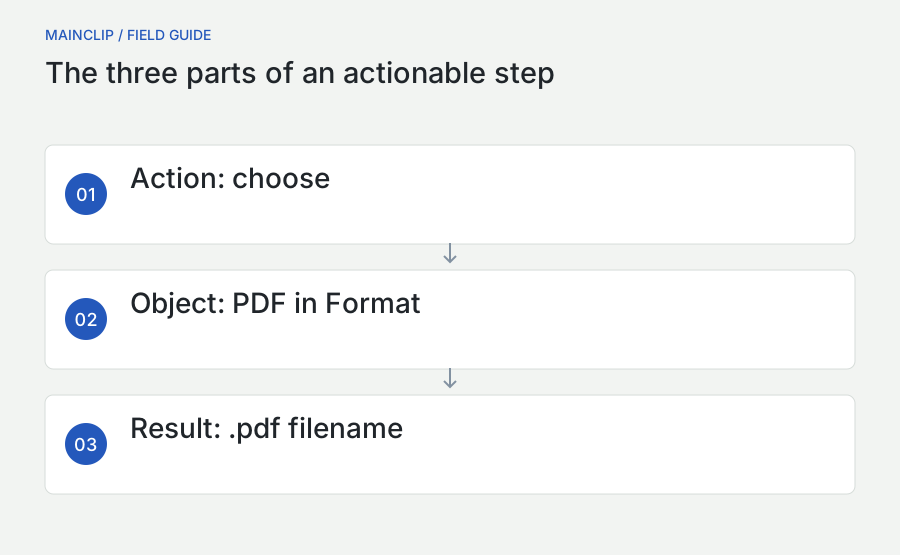
Start each instruction with the action the reader should perform, then name the object precisely. “Choose PDF from the Format menu” is stronger than “Select the correct format.” It identifies both the location and the intended value. Add the expected change where it helps the reader decide whether to continue: “The filename ends in .pdf.” This is a checkpoint, not a promise that every unrelated application uses the same behavior.
Keep one meaningful action per numbered step when the action changes the interface or requires a decision. Two small actions can share a step when they form one obvious operation, such as entering a filename and confirming it. Break a step when the reader must wait, inspect a result, or choose between paths. Long instructions joined by repeated “and then” are a sign that important checkpoints are being compressed out of view.
Replace vague location words
“Click here,” “use the option above,” and “press the green button” depend on the layout, image, or color being available. Name the control instead. You can add location as a secondary cue: “Click Export in the upper-right corner of the project window.” This remains understandable when the reader uses a different theme or enlarges the page. If a control has no text label, describe its shape and function and provide a focused image.
Use the interface's actual wording for controls, while keeping explanations in ordinary language. If a menu says Destination, do not alternate between Destination, Output, and Save Location as though they were three separate controls. A short terminology list in the authoring notes helps maintain consistency across contributors. It also makes translation easier because translators can distinguish quoted interface labels from general descriptions of the task.
Annotate to direct attention without concealing evidence
An annotation should explain what to notice, not compete with the interface. Choose one simple visual grammar for the guide. Numbered markers can link locations to ordered actions. Arrows can identify a specific control. A rectangle can group a region that the reader needs to inspect. Use text labels sparingly, because long text belongs in the article where it can resize, be selected, and be translated.
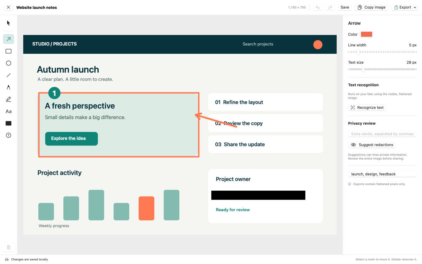
MainSnap provides arrows, lines, rectangles, ellipses, pen marks, highlights, text, numbered markers, and solid redactions. Its exported images flatten the annotations into the resulting picture. Those tools can support this workflow without requiring the guide to depend on a particular post-capture preference. Capture behavior varies by installed version and settings; the public procedure here does not depend on a temporary preview appearing automatically.
Place arrowheads near the target without covering its label. If an arrow could point to either of two neighboring controls, shorten the target region or add an unambiguous caption. Keep numbered markers clear of values that readers need to compare. A circle numbered three placed over the third task's checkbox can obscure the very selection state the image is meant to show.
Make annotation numbers local or global deliberately
For a short guide, markers can match the main step numbers. For a long guide with several screenshots per section, restarting markers in each image is often easier to maintain. Either approach works when captions explain the relationship. Do not mix the two accidentally. If an image displays markers one and two beside prose steps six and seven, state that the markers identify the two controls used within that stage.
Remove private information before publishing the sequence
Review more than the center of each screenshot. Window titles, browser tabs, sidebar folders, recent-file lists, avatars, and background notifications can disclose information unrelated to the task. A screenshot of an export dialog may expose a home-folder name even when the document itself contains only sample content. Reduce what is captured before relying on later redaction.
When you must cover information, use an opaque redaction in the delivery image and inspect the exported file itself. A translucent highlight is an attention tool, not a reliable way to remove text. In MainSnap, use the redaction tool for covered areas and export the flattened result. Keep the source document out of the publication folder. The public guide needs the reviewed export, not the app's editable history or an archive containing original captures.
Check the prose and filenames too
An image can be clean while its caption reveals the information you removed. Search the draft for sample account names, internal hostnames, and real project identifiers. Review image filenames and any surrounding download links. If you replace a customer name in the picture with “Sample Account,” use the same substitution throughout the procedure so that readers can follow the example without learning the original identity.
Use a final review pass dedicated to privacy rather than trying to combine it with typography corrections. Read each image as if you knew nothing about the project and ask what it reveals beyond the instructional point. This is a practical editorial review, not a guarantee that every possible sensitive detail has been detected. For material governed by workplace rules, involve the appropriate reviewer before publication.
Make the guide usable when the images are unavailable
Every essential action should be present in text. A reader may use a screen reader, a narrow display, a text-only export, or a connection on which images load slowly. The screenshot should confirm a location or explain a visual relationship; it should not contain the only instruction to choose a particular option. Try reading the numbered steps while temporarily ignoring the pictures. Any missing action belongs in the prose.
The W3C guidance on informative images recommends text alternatives that convey the information relevant to an image's purpose. Apply that principle to a screenshot by describing the useful state, rather than listing every visible element. For example: “Export panel with PDF selected and Weekly Tasks.pdf entered as the filename.” This tells the reader why the screenshot is included.
A caption and alternative text can serve different needs. The caption can connect the image to the procedure: “Check the format before choosing the destination.” Alternative text can describe the pictured state. Avoid forcing a complete page of instructions into an image's alternative text. If the image shows a branching workflow, supply an ordinary text explanation of each branch beside it.
Describe complex visual relationships in the article
For a diagram with several paths, give a concise identification and an accessible longer explanation. W3C's complex-image guidance describes this short-description-plus-detail approach. In a procedure, the longer explanation can be a list or table that names the condition for each path and where it rejoins the main sequence. Readers should not have to infer an entire decision tree from colored arrows.
Handle optional paths without breaking the main sequence
A guide often has one common route and a few exceptions: the reader already created a folder, a permission was granted earlier, or the interface opens in a different tab. Explain those differences at the point where they matter. A long collection of warnings at the beginning is difficult to remember, while a surprise branch halfway through an instruction forces the reader to backtrack.
Use a condition followed by an action. “If a file with this name already exists, choose a new sample name before saving” is actionable. “Your screen may differ” is usually not. When a branch includes several steps, give it a short heading and an explicit return point: “After the folder opens, continue with Choose the export format.” Stable section links help readers navigate without searching for a number that may change during editing.
| Condition | Reader action | Return point |
|---|---|---|
| The sample project is already open | Confirm its title and contents | Choose the tasks |
| The destination folder does not exist | Create a disposable training folder | Enter the filename |
| The chosen filename already exists | Use a different sample name | Save the export |
| The exported file does not match the selection | Stop and recheck the selected tasks | Repeat the export deliberately |
Do not document every possible error as an equal branch. Keep the common procedure readable and link to a focused troubleshooting section for uncommon problems. An exception deserves space when it changes the next safe action, not merely because it could theoretically happen.
Worked example: turn a rough export note into a complete guide
Suppose a teammate gives you this rough note for the fictional Fieldboard application: “Open the board, pick the tasks, export as PDF, and send it.” The note assumes the reader can identify the correct board, understands how selection works, knows which export command to choose, and knows how to check the file. It also combines creation and distribution without establishing who should receive the result. Rewrite it around a narrower outcome: create a PDF containing three sample tasks in a training folder.
Define the start and finish
The starting state is Fieldboard open to a project named Training Board, containing exactly three synthetic tasks: Draft outline, Review examples, and Publish practice copy. The destination is a disposable folder chosen by the reader. The finishing state is a PDF in that folder whose contents match those three tasks. Sending the document is outside this guide, so no accidental sharing action is hidden in the last step.
- Open Training Board. Check that its heading appears above the task list. If a different project is open, return to the project list and choose Training Board before continuing.
- Select the three sample tasks. Use the selection controls beside Draft outline, Review examples, and Publish practice copy. Confirm that the selection count is three.
- Open the export panel. Choose Export Selected from the project actions menu. The panel should describe the selected tasks, rather than the entire project.
- Choose PDF as the format. Keep the other options at their training defaults. If your panel does not offer PDF, stop and check that you are using the version covered by this fictional example.
- Choose the training folder. Select a folder containing only practice material. Enter Weekly Tasks.pdf as the filename, or use a new sample name if that file already exists.
- Save the export. Wait until the export panel closes or the application confirms completion. Do not repeat the action while it is still working.
- Open the resulting PDF. Confirm that all three sample task names appear and that no unrelated task is included. The task is complete when the output matches the selection.
The wording deliberately describes a fictional interface. To adapt the pattern to a real application, replace each label with its actual current wording and perform the procedure again. Do not publish the Fieldboard controls as though they belonged to another app. The reusable part is the structure: establish state, perform action, inspect result, and provide a safe branch when the expected result is absent.
Assign images to decisions
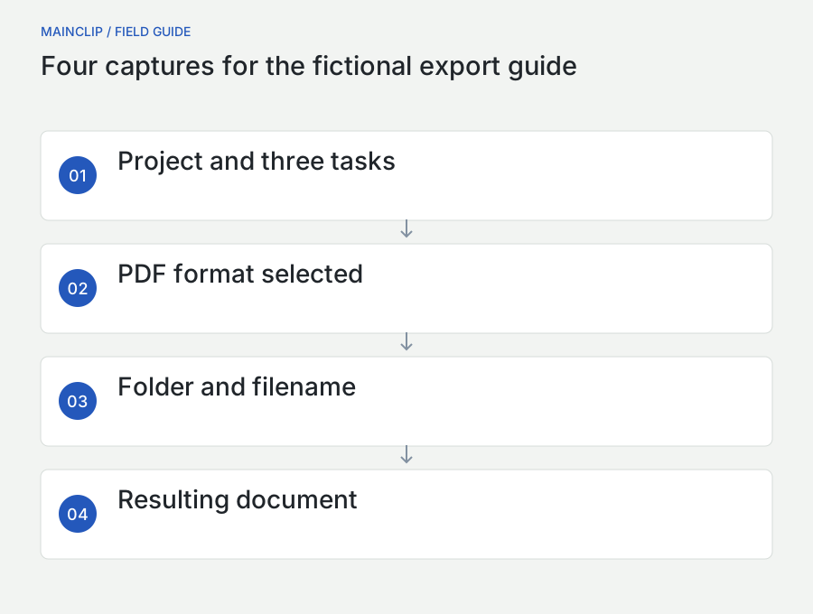
Image one should show Training Board with the three task names visible, giving the reader orientation. Image two should show the export panel with PDF selected, because the format choice is a meaningful decision. Image three should show the destination and sample filename. Image four should show the resulting document. There is no automatic need for a separate screenshot of the mouse moving, the menu closing, or the application waiting.
A useful caption for image two is: “PDF is selected for this training export.” An unhelpful caption is: “Export screen.” The first names the relevant state; the second merely repeats what the picture already resembles. If an image contains a marker pointing to the selected format, the surrounding step still says which format to select. The marker reinforces the instruction instead of carrying it alone.
Resolve a realistic discrepancy
During review, imagine that the output contains only two tasks. Do not immediately add “select all tasks carefully” to the opening paragraph. Investigate where the guide stopped matching the interface. Perhaps the selection count was never visible in the first image, or the rough note confused a highlighted row with a selected checkbox. Improve the step that introduces the ambiguity, then repeat the whole procedure from the reset state.
If the application itself behaves inconsistently, do not conceal that with an idealized screenshot. Record the limitation and determine whether a documented workaround is appropriate. A guide should describe a route the reader can actually complete. Where the route is not reliable enough to recommend, a troubleshooting article or bug report may be the better deliverable.
Reuse reference material without losing its meaning
While writing, you may repeatedly need the same sample link, short label, or approved explanatory sentence. Clipboard history can reduce the need to reopen source documents. MainClip keeps supported copied content locally while monitoring is enabled and offers search, tags, favorites, and source-related information. Use those organizational features to distinguish reusable authoring material from incidental content copied during the capture session.
For example, you can keep the training project name, the agreed description of the output, and a link to the current draft together under a documentation tag. Before pasting, read the item and confirm that it belongs to the current guide. A remembered clip is not automatically a current fact. An old button label can reintroduce an error even when the latest screenshots are correct.
MainClip does not perform OCR, write instructions with AI, or synchronize this material through its own cloud service. If you need text from an image, obtain and verify it through an appropriate separate tool, then copy the reviewed result. Keep the drafting decision with the author. A clipboard history is useful for retrieving material, but it does not know whether a copied paragraph is suitable for publication or authorized for a particular audience.
Keep an actual source of truth
Store approved wording in the guide's source file or editorial notes, not only in clipboard history. Clips are working aids. The document should still be complete if a clip is deleted, monitoring is paused, or a different author takes over. When you paste a reusable explanation, adapt the surrounding transition so that the text answers the current reader's question rather than sounding like an unrelated standard reply.
Export images for the place where readers will see them
Choose image dimensions and format with the destination in mind. A screenshot that fills your monitor may be displayed in a narrow article column or a phone browser. Inspect the smallest text at that reading size. If it is unreadable, a focused capture or a separate detail image is usually more helpful than forcing the reader to enlarge a complete desktop screenshot after every step.
MainSnap can export annotated images as PNG, JPEG, or PDF. For interface text, a PNG is a useful starting point because it avoids adding JPEG compression artifacts during that export. A PDF export is an image-based document, not a conversion of the screenshot's labels into editable interface text. Choose the format that the receiving document or publishing system handles appropriately, and inspect the result after insertion.
Verify the delivered route
Open the actual draft page or document, rather than judging only the files in Finder. Confirm that captions sit beside the right images, the image order matches the steps, and any click-to-enlarge behavior works as intended. If the publishing system generates smaller image variants, inspect the one a narrow browser receives. A sharp source does not prove that the final page displays enough detail.
Use stable descriptive names for public image files, such as export-pdf-format.png. When a substantive image changes, follow the site's versioning or cache strategy rather than assuming that replacing a local file refreshes every reader's view. Keep the authoring source and publication assets connected through a small inventory that records their purpose, placement, and last reviewed version.
Review the procedure as a task, not just as prose
Proofreading catches spelling and punctuation. A task review catches missing actions, incorrect assumptions, and ambiguous outcomes. Ask a reviewer to start from the documented prerequisites and follow the guide without supplementary coaching. If you explain an omitted step verbally, note the interruption and improve the document afterward. Otherwise the successful run proves only that the guide works with the author standing beside it.
Give the reviewer a concrete result to produce and ask them to record where they hesitate. A hesitation does not automatically require another screenshot. It might require a clearer control name, a prerequisite, a better branch, or a statement that an operation takes a moment. Choose the smallest editorial change that resolves the actual uncertainty, then verify the revised route.
| Review pass | Question to answer | Evidence to record |
|---|---|---|
| Procedure | Can the task be completed from the stated start? | Missing actions and unexpected states |
| Images | Can the relevant controls be read at delivery size? | Specific image and unreadable label |
| Accessibility | Do the text and image descriptions carry the essential information? | Instruction that currently depends on sight alone |
| Privacy | Does the public material expose anything unnecessary? | File and location requiring revision |
| Maintenance | Can another author identify what version this describes? | Missing version or ownership note |
Record only reviews that actually happened. “Reviewed on a second Mac” is a factual statement that requires a real second-Mac check. If you reviewed only the exported files and the textual route, say so in the internal notes. Specific evidence is more useful than a broad “tested” label, especially when a guide covers a configuration that not every author can reproduce.
Make future updates smaller and more reliable
A guide becomes stale when an interface changes, but also when the assumed audience, permissions, or sample data change. Give the source a named owner and a short change record. Record which application version and language the captures represent. Set a review trigger tied to something meaningful, such as a redesigned export panel or a changed permission flow, instead of treating every calendar date as proof that the content has been checked.
Keep image changes connected to the affected instructions. Replacing a screenshot while leaving an old control name in the text creates a new inconsistency. For each revision, inspect the action, expected state, caption, alternative text, and image together. If one changes, ask whether the others still describe the same moment. This small dependency check is easier than rereading a large guide without knowing what prompted the update.
When your documentation is maintained on GitHub, a branch link can show newer content later. GitHub documents how to create a link tied to a specific commit, including the Y-key shortcut in a file view. Use a permanent file link when a review or release note needs to identify exactly which source revision was examined.
Retire obsolete instructions deliberately
If the old procedure still matters to supported users, label its version scope and link to the newer route. If it no longer applies, redirect or archive it according to the publishing system's rules. Leaving two nearly identical articles without a visible distinction forces readers to guess which one is current. A short, honest scope statement is more useful than silently replacing screenshots while keeping an inaccurate publication history.
Prepare a guide that can survive language and layout changes
A translated guide needs more than translated paragraphs. Interface labels, screenshots, sample filenames, captions, and alternative text must agree with one another. Decide whether each language edition will show the application in that language or use a shared English interface. Either policy can work, but tell the reader which one applies. A German instruction naming a translated button beside an English screenshot can be confusing unless the relationship is explicit.
Keep a small label map for controls that appear repeatedly. Give each control its actual interface text and a short explanation of its role. This lets a translator distinguish a product label from an ordinary word. If the real interface uses a term unexpectedly, preserve that label in the instruction and explain it once rather than silently replacing it with a more natural term that the reader cannot find.
Keep directional references secondary
“Choose the project in the sidebar” travels better than “click the item on the left.” A different layout, window size, or right-to-left interface can move the sidebar. Similarly, refer to Previous and Next by their visible labels instead of assuming a particular arrow direction conveys the same meaning everywhere. The screenshot provides useful orientation, while the named control remains the primary instruction.
Leave room for longer translated labels when composing captures and adding annotations. A short English label may require several words in another language. An arrow placed tightly against the original text can cover its translated equivalent. Where you maintain separate captures, recreate the same state rather than repainting the text inside an English screenshot. Repainting can hide differences in spacing, truncation, or available controls that the reader will actually encounter.
Separate translation review from workflow review
A fluent translation can still describe the wrong sequence, and a correct sequence can still use unnatural or ambiguous wording. Ask reviewers to identify which question they are checking. For the Fieldboard example, a language reviewer could confirm that the destination instruction is clear, while a workflow reviewer verifies that the three sample tasks remain selected through the export. Neither review should be reported as the other.
Use descriptive section identifiers that remain stable when headings are translated. An internal link to export-format can survive a wording change more easily than a link whose identifier repeats a long heading. After a translation update, check that captions still refer to the correct images and that a branch returns to the intended section. These are small mechanical checks with a direct effect on whether the reader can follow the guide independently.
Practice the method with a small, reviewable task
Choose a harmless task you can repeat, such as exporting a sample document into a training folder. Write the completion check before the steps. Perform the task once and mark the points where you made a decision. Draft no more screenshots than those decisions require, then write a capture brief for each. This exercise keeps the work small enough that you can revise the entire sequence instead of polishing isolated images indefinitely.
Exercise one: remove the pictures
Read your draft with all images temporarily hidden in your working copy. Can you identify the starting location, the exact controls, the values to enter, and the success condition? Write down each place where you cannot. Restore the images and fix the prose at those points. Do not solve the exercise by moving the full instruction into alternative text; the main procedure should remain clear to every reader.
Exercise two: change one condition
Repeat the task with a different but supported starting condition. Perhaps the destination file already exists or the project opens in another view. Decide whether the guide needs a short branch or a stronger prerequisite. Keep the variant bounded and reversible. The exercise is meant to reveal assumptions, not to encourage experimenting with production accounts or deleting real work.
Exercise three: hand over the source
Give another author the draft, image inventory, reset recipe, and sample material. Ask them to replace one screenshot without relying on your memory. Can they find the correct source, recreate its state, preserve the caption's meaning, and identify the delivery file? Any information they need but cannot find belongs in the authoring notes. A maintainable guide is an artifact another person can revise confidently.
Before publication, confirm that the expected result is explicit, the procedure matches the captured states, and the delivery images are the reviewed exports. Verify section links, captions, and descriptions in the real destination. Keep the final sequence focused on the reader's task. The finished guide should let someone act, recognize progress, recover from a documented difference, and know exactly when they are done.